
Rome Apartment Building
New Architecture in the heart of old Rome
Jun 11, 2004

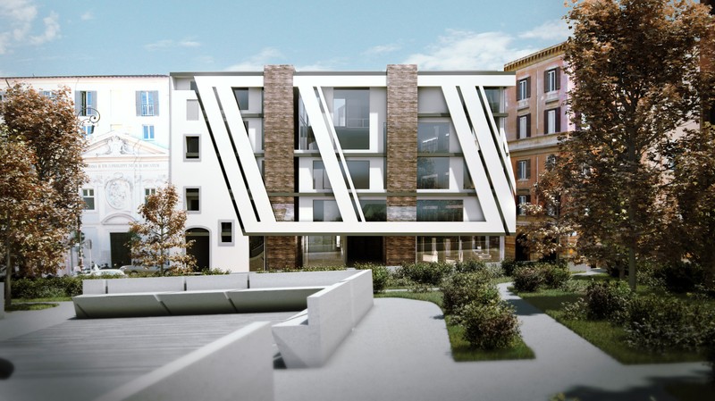
The Daadkracht project is the design of a four story mixed-use building in the heart of the old city of Rome, offering three spectacular apartments, shops, and a restaurant. Part of the design is a city park bordering the Tevere river, a church and various other historical buildings.
The project presented a unique opportunity to design the first new non-cultural edifice in Rome after Mussolini. To honour this event, an extensive study into the history of Rome, both its ancient past, turn of the century socio-cultural and political developments and modern developments were used as a driving force behind the design of this building.
Combined with a systemic sustainable building strategy, this proposes the concept of a stunning piece of modern architecture, exemplary sustainable in its materials and performance, that will remain a desired new monument in the city.
The building contains galleries, shops, a restaurant and reception spaces on the ground floor. These spaces interface with the surrounding fabric. A pedestrian route is cut through the building, allowing the public to interface with its complex layers. The apartments and offices in the building have been designed to accommodate a change in function over the years. The apartments can easily be used as an office or atelier, and the offices have been designed as such that apartments, restaurant or other functions can easily be accommodated.
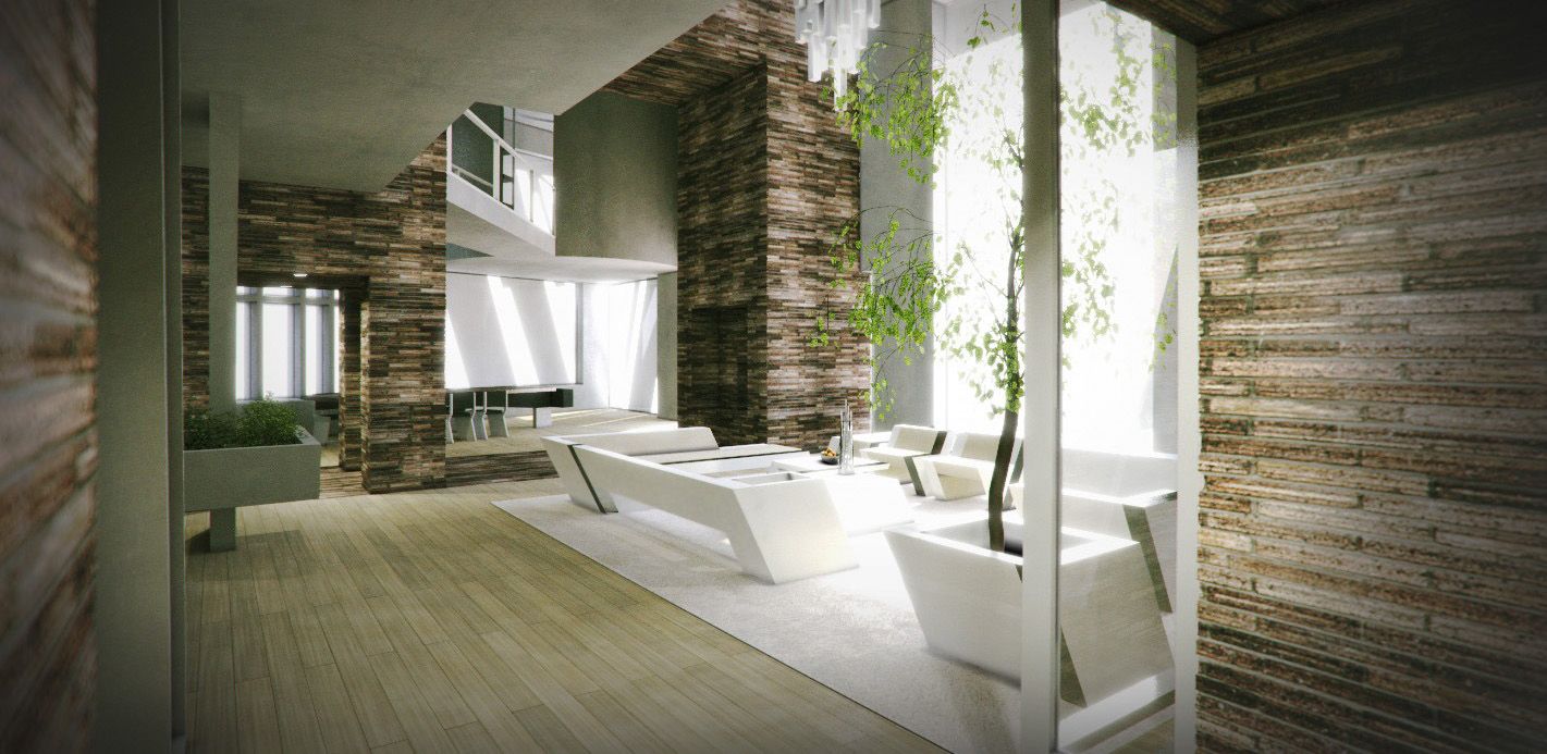
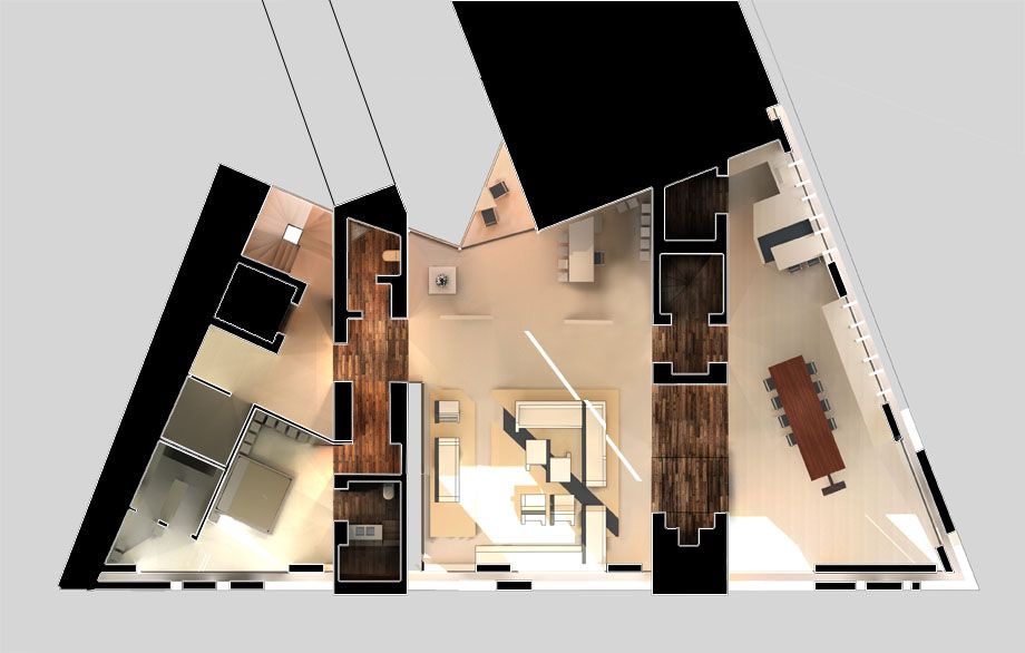
The main apartment at the top of the building features a small library referencing the central 'retreat’ space at Hadrien’s ancient Villa at Tivoli. Functioning as a hinge between the facades it brings to the concept new meaning and use.
The large walls contain all small intimate spaces such as bathrooms, entry routes to bedrooms, hidden stairwells and storage rooms. They also serve as a boundary indicator between public and private in the house.

The building makes use of ground coupled thermal heating and cooling systems to cool and store excess heat in summer, to be used in winter. The building has adaptive external sunshading operating in between the orthogonal and slanted facade layer. The shades interacts creatively with the design of the facade, and thus becomes more than just a functional element. A roof designed for an array of solar panels and solar collectors in combination with thermal mass design of the various spaces allows this building to operate with zero net energy throughout the year.

The bedrooms are always cool and more intimate due to their reduced exposure to the sky, and their wedging between two large thermal masses. The thermal mass of the building is air-cooled through several passive chimney routes that are blended in with the architectural experience.
The living rooms are bright and airy due to their external spaces that emphasize the living inside-and-out nature of the mediterranean climate and culture. One can, for instance, walk from the kitchen to the bedroom through the outside without making a detour.
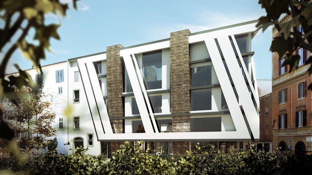
The design of the building expresses the importance of a contemporary incision into the fabric of ancient Rome, while interacting with the complex history of the location. The building consists of two large structural walls made from roman brick. These literally lift the building up in the air. Taking their inspiration from the Therme di Caracalla, Trajan’s Market and other ancient brick structures in Rome, these walls reflect the foundations of the city and our civilization.
An orthogonal 'modernist’ layer on top of this functions as the inner shell. It is reflexive of the importance that the modernist movement has played on our current culture and Rome in the form of EUR and other large infrastructural works. This layer captures many of the functional aspects of the building.
The third, slanted layer refers to contemporary design directions such as deconstructivism. Floating in front of the 'modernist layer’ it plays a lyrical game with the main facade while receiving support from the older layers. The angle of the main facade elements take their cue from a historic facade element on the site that used to support the adjacent small church. The slanted layer establishes presence on the square, and enters a dialogue with the formal renaissance surroundings. Clashing with its past, it cannot escape its inevitable roots. Where the two main facades meet at the corner, a a distinct point is formed, marking the archeological importance of this precise spot, once the exact center point of ancient local urban development that still dictates the form of the building and the urban fabric surrounding it.
This project was documented in a set of six large format books. The first book can be used as an architectural history guide through the various regions of Rome. Subsequent books analyse the work of architect Richard Meier, a contributor and inspiration to this project. Environmental analysis, Design, material selection and the development of the Daadkracht theme and imagery take up the other volumes.
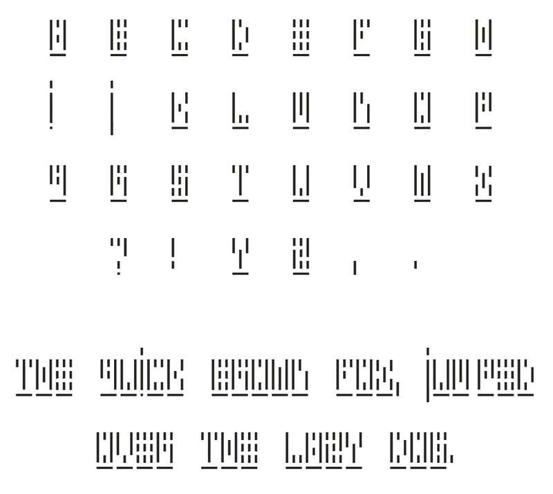
A font was also developed for this project. The Daadkracht font is designed to be a challenge to read, but decipherable upon study. It is inspired by Wim Crouwel’s font “New Alphabet” from 1966. It consists, just like the collage imagery, of only vertical elements, and a ground plane. The ground plane indicates each character’s length, necessary for distinguising the individual characters from one another. The daadkracht font can be downloaded here in TrueType format for free. See the image of the font below for a preview.
June 11, 2004
Director